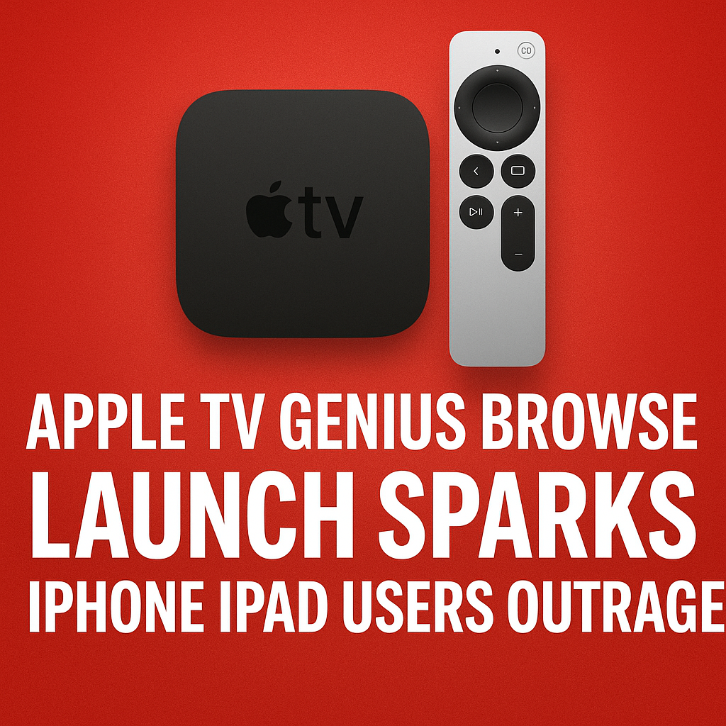
Apple TV’s latest interface experiment, dubbed the “Genius Browse” launch by many early watchers, is already stirring up a wave of frustration across iPhone and iPad communities. What was positioned as a smarter way to discover movies, shows, and live sports inside the Apple TV app has instead triggered complaints about cluttered navigation, inconsistent recommendations, and a discovery experience that feels more like an ad carousel than a personalized guide. As users compare notes on social media and forums, one message keeps surfacing: Apple may have optimized the browsing experience for content partners and promotions, but not for the people actually trying to find something to watch.
What Is the Apple TV “Genius Browse” Launch?
The “Genius Browse” label isn’t a formal product name prominently marketed to the public in every region, but it has become shorthand for Apple’s newest browse-first approach in the Apple TV app. The idea is familiar: use on-device signals, viewing history, subscription status, and trending data to surface the “right” content at the “right” time—ideally reducing the endless scrolling many viewers experience when deciding what to stream.
In practice, users describe the new browse experience as heavier on tiles, bigger on banners, and more aggressive about pushing Apple TV+ originals, add-on channels, and partner apps. Instead of feeling like a quiet, helpful concierge, “Genius Browse” is being perceived as a louder storefront that competes with the “Up Next” queue and makes basic navigation take more taps than before.
Why iPhone and iPad Users Are So Upset
Outrage is a strong word, but the reaction from iPhone and iPad users has been notably intense because the Apple TV app is meant to be a central hub. When that hub changes, it affects day-to-day habits: continuing a show, finding purchased content, switching between family members, or simply browsing without being nudged toward subscriptions.
1) The “Up Next” Experience Feels Less Central
For many Apple TV app users, “Up Next” is the whole point. It’s the watchlist, the resume button, and the personal dashboard. Complaints suggest the new browse-led layout makes “Up Next” feel secondary, either by pushing it lower on the screen or surrounding it with promotional rows that dilute its usefulness.
- Users report more scrolling before reaching the content they actually want to resume.
- Some say the app “forgets” where they were, especially when jumping between iPhone, iPad, and Apple TV hardware.
- Promotional placements can make it harder to spot the next episode quickly.
2) Recommendations Don’t Feel “Genius”
Personalization is only as good as relevance. A major source of frustration is the sense that recommendations are driven by marketing priorities rather than user taste. People expect Apple’s machine learning to be subtle and accurate. Instead, many describe repetitive suggestions, genre mismatches, or content they’ve already ignored repeatedly.
- Too many repeated tiles across multiple rows.
- Suggestions for channels or services users don’t subscribe to.
- Recommendations that don’t match viewing history, especially for shared devices.
3) It Feels Like an Advertisement Layer
Another complaint: the Apple TV app is increasingly resembling a storefront. Large hero banners and partner-driven rows can make the interface feel like it’s selling content rather than helping users manage it. iPhone and iPad users, in particular, notice this because they interact in short sessions—opening the app to continue watching, not to shop.
This is where trust becomes an issue. Users want to believe that Apple’s curation is primarily for their benefit. If “Genius Browse” is interpreted as a monetization feature first, it creates a perception that the app is less user-centric than it used to be.
4) More Taps, More Friction on Mobile
What looks fine on a big TV can feel cumbersome on a smaller screen. A browse-first UI often means more horizontal rails, more deep links, and more modal screens. On iPhone and iPad, that can translate to extra taps and less clarity about where you are in the app.
- Harder to quickly filter between Movies, TV, Sports, and Library.
- Content details sometimes require extra steps to see what service it’s on.
- Discoverability improves for some users, but speed declines for others.
5) Confusion Around Library and Purchases
One of the most sensitive topics in Apple TV app changes is access to purchased content. Users who buy movies or seasons through Apple expect the Library to be stable, prominent, and easy to navigate. When the app’s browsing experience gets redesigned, the Library can feel “tucked away,” creating anxiety that purchased content is being deprioritized in favor of subscriptions.
What Changed in the Apple TV App Interface?
While Apple doesn’t always provide granular public change logs for every interface adjustment, user feedback points to a few perceived shifts that align with the “Genius Browse” concept:
- Heavier emphasis on discovery: More curated rows, trending collections, and editorial groupings.
- Bigger promotional surfaces: Larger banners and more frequent highlight placements.
- Service-forward suggestions: More prompts to start trials, add channels, or open partner apps.
- Different prioritization: “Up Next,” Library, and search may feel less immediate depending on device and layout.
Some users like these changes, especially those who enjoy browsing and discovering new releases. But the backlash suggests Apple TV’s user base includes a large segment that values efficiency over exploration.
The Core Issue: Apple TV as a Hub vs. Apple TV as a Store
The Apple TV app has long had an identity challenge. Is it a unified “TV guide” that organizes streaming subscriptions, purchases, and watch progress? Or is it a destination designed to promote Apple TV+ and upsell add-ons?
The “Genius Browse” launch highlights the tension between those two goals. When Apple leans toward the store experience, users who treat the app as a utility feel disrupted. When Apple leans toward the hub experience, content partners may feel less visibility. The outrage from iPhone and iPad users suggests the balance has shifted too far toward promotion.
How This Impacts iPhone and iPad Viewing Habits
Mobile viewing is different from living-room viewing. People use iPhone and iPad for quick catch-up episodes, commuting, bedtime viewing, and short breaks. In those moments, speed matters more than breadth. If “Genius Browse” introduces friction, users will adapt in predictable ways:
- They bypass the Apple TV app: Opening Netflix, Disney+, Prime Video, or Hulu directly instead of using Apple as the hub.
- They rely on search: Using Spotlight or in-app search rather than browsing rows.
- They abandon recommendations: Sticking to known shows and ignoring suggested content.
- They turn off tracking/personalization: If they feel targeted, they may reduce data sharing, making recommendations worse.
Possible Reasons Apple Rolled This Out
From Apple’s perspective, a “Genius Browse” strategy makes business and product sense—even if the execution is contentious. A few likely motivations:
- Increase engagement: Browsing interfaces keep users in the app longer.
- Promote Apple TV+: Apple wants its originals to be front-and-center.
- Boost channel subscriptions: Add-on channels are a key revenue stream.
- Compete with rivals: Other streaming platforms are doubling down on recommendation engines and discovery pages.
The problem isn’t that Apple wants discovery. The problem is when discovery displaces control—especially for loyal users who’ve built habits around “Up Next” and Library.
What Users Want Apple to Fix
If Apple aims to calm iPhone and iPad users outraged by the new Apple TV browsing approach, the wish list is fairly consistent across communities:
- Make “Up Next” dominant again: Keep it at the top and reduce surrounding clutter.
- Add customization controls: Let users pin tabs, hide rows, or choose a “Minimal” home view.
- Improve recommendation quality: More “Not interested” controls and fewer repeats.
- Clarify where content plays: Make service labels obvious before users tap.
- Respect purchases: Ensure Library remains prominent, consistent, and easy to browse.
Can You Change or Reduce the “Genius Browse” Feel Right Now?
Options vary by region, iOS/iPadOS version, and account configuration, but users often find partial relief by adjusting settings and habits:
- Use Search intentionally: Search can bypass promotional rows and get you straight to a title.
- Curate “Up Next”: Remove clutter, finish episodes, and keep your queue clean.
- Check notification and recommendation settings: If prompts feel excessive, reducing notifications can help.
- Open partner apps directly: If Apple TV’s hub becomes annoying, going straight to the service may be faster.
Still, most of the anger stems from design choices users can’t fully control. That’s why the backlash is aimed at Apple rather than at individual settings.
What Happens Next for Apple TV on iPhone and iPad?
Apple typically iterates quickly when feedback is loud and sustained, especially when it involves core apps on iOS and iPadOS. If “Genius Browse” continues to generate negative sentiment, Apple may respond in subtle ways—tuning recommendation logic, reducing repetition, or adjusting the prominence of “Up Next.”
The larger question is whether Apple views the Apple TV app as a utility for existing customers or a growth engine for services revenue. The answer will shape how browsing evolves. If Apple can offer a truly customizable home screen—one that lets efficiency-focused users keep a clean dashboard while discovery-focused users keep the browse experience—much of the outrage could fade.
FAQs
What is “Genius Browse” in the Apple TV app?
“Genius Browse” is a nickname users have given to Apple TV’s newer browse-first discovery experience, where the app emphasizes curated rows, recommendations, and highlighted content to help people find something to watch.
Why are iPhone and iPad users angry about the Apple TV app update?
Many users feel the interface now prioritizes promotions and browsing over fast access to “Up Next” and Library, creating more taps and less control—especially on smaller screens where speed matters.
Did Apple remove or hide purchased movies and shows in the Library?
Purchased content generally remains available, but some users report the Library feels less prominent or harder to reach due to layout changes and increased emphasis on discovery and subscriptions.
Can I turn off Apple TV recommendations or the new browse layout?
There isn’t always a single switch to disable the browse-focused design. You can reduce friction by using Search, managing “Up Next,” and adjusting notification or personalization-related settings where available.
Will Apple change the Apple TV app again after the backlash?
Apple often refines interfaces based on user feedback. If complaints about relevance, clutter, and navigation remain strong, future updates may rebalance the home screen, improve recommendations, or add customization options.